Please visit our latest Introduction to components section in our support page
1. Introduction
CraftMyPDF template editor is an easy-to-use web template editor for designers, developers, or even non-developers to quickly design a PDF template in the form of drag-and-drop.
The PDF template editor consists of a rich set of components for you to build beautiful PDFs with powerful expressions, page breaks, and data bindings.
To learn about the basics of designer, sections, data-binding, page breaks, head over to our Getting Started guide.
In this article, we will cover all the components of the PDF designer.
2. Components
2.1 Label
The label component is used for a multitude of purposes. They are a powerful way of displaying labels, descriptions, summaries, and other text data on your PDF templates. It can be used with expression fields to create dynamic PDF documents.
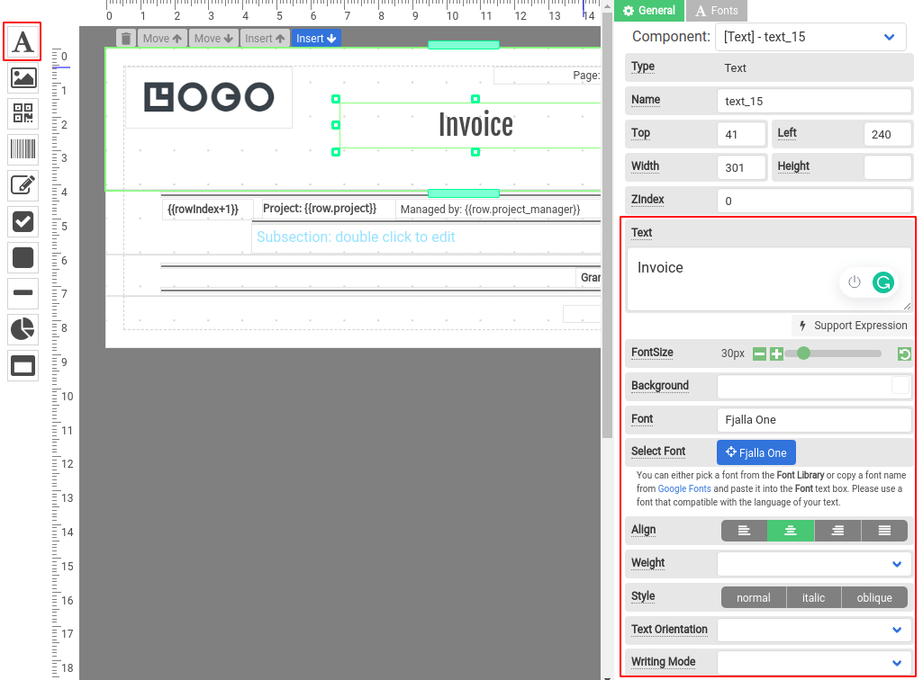
To create a Label component, drag a Text component and drop it to where you want it to appear.
2.1.1 Properties of a Label component
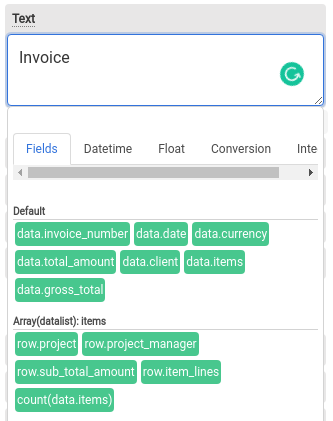
Text: The text of the Label supports expressions. Hover your mouse cursor on the property, it will display the expressions and JSON fields that you may use for your text.
Font size: The size of the font of the Label element.
Background: Background color of the Label element.
Font: Font family the Label element, use “Select Font” to select a font.
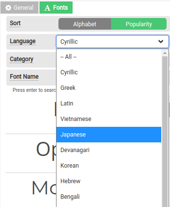
Select Font: Click on the Blue button to choose a font from our font library. We support different languages, remember to select a font that is compatible with the language of your text, or else your generated PDFs will display with square boxes.

Align: the horizontal alignment of the text inside the Label element. Supported alignments: left, right, center, and justified.
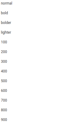
Weight: The weight (or boldness) of the font. The weights available depend on the Font that is currently set.
Style: Determine a font that should be styled. The options are normal, italic, or oblique.
Text Orientation: The orientation of the text characters in a line. It only affects the text in vertical mode (when Writing mode is not horizontal-tb). It is useful for controlling the display of languages that use the vertical script, and also for making vertical table headers.
Writing Mode: Determine lines of text are laid out horizontally or vertically, as well as the direction in which blocks progress.
Padding: Padding of the Label element.
2.1.2 Support of languages for Labels
We support different languages, remember to click on Select Font to select a font from our Font library that is compatible with the language of your text or else your generated PDFs will display with square boxes.
2.2 Image
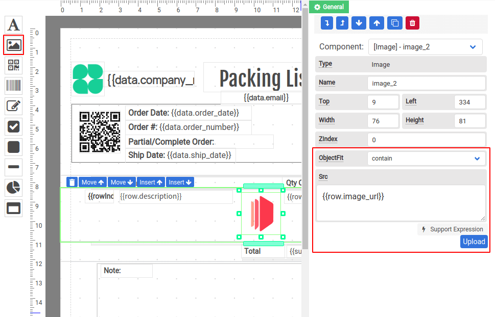
The image component is used for displaying images. To create an Image component, drag an Image component and drop it to where you want it to appear.
Properties
Object Fit: It determines how the image should be resized to fit its container.
- Contain – The image is scaled to maintain its aspect ratio while fitting within the Image.
- Cover – The image is sized to maintain its aspect ratio while filling the element’s entire Image.
- Fill – The image is sized to fill the Image component.
- Scale-down – The image is sized as if
noneorcontainwere specified, whichever would result in a smaller concrete object size.
Src: The property contains the path to the image you want to embed. It can be used along with expressions to create a dynamic image.
2.3 QRCode
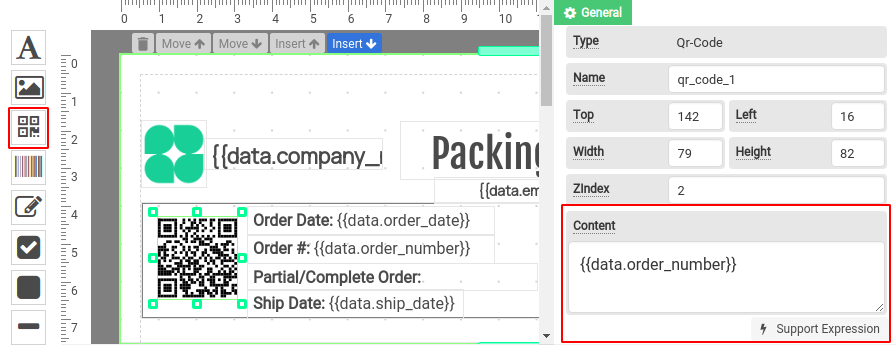
QRCode is a two-dimensional barcode that consists of black squares and is capable of storing data. The QR codes are readable by most modern devices.
To create a QRCode component, drag a QRCode component and drop it to where you want it to appear.
Properties
Content: The information to be encoded into QRCode. It can be used along with expressions to create a dynamic QRCode.
2.4 Barcode
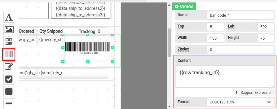
Barcode is a one-dimensional of parallel lines of varying widths and capable of storing data. The bar codes are readable by optical readers.
To create a Barcode component, drag a Barcode component and drop it to where you want it to appear.
Properties
Content: The information to be encoded into QRCode. It can be used along with expressions to create a dynamic QRCode.
Format: Supported standards for the Barcode component.
2.4.1 Supported standards/formats
| Name | Supported barcodes |
| CODE128 | CODE128 (auto and force mode) |
| CODE39 | CODE39 |
| EAN / UPC | EAN-13, EAN-8, EAN-5, EAN-2, UPC (A) |
| ITF | ITF, ITF-14 |
| MSI | MSI, MSI10, MSI11, MSI1010, MSI1110 |
| Pharmacode | Pharmacode |
| Codabar | Codabar |
2.5 HTML component for richtext and tables
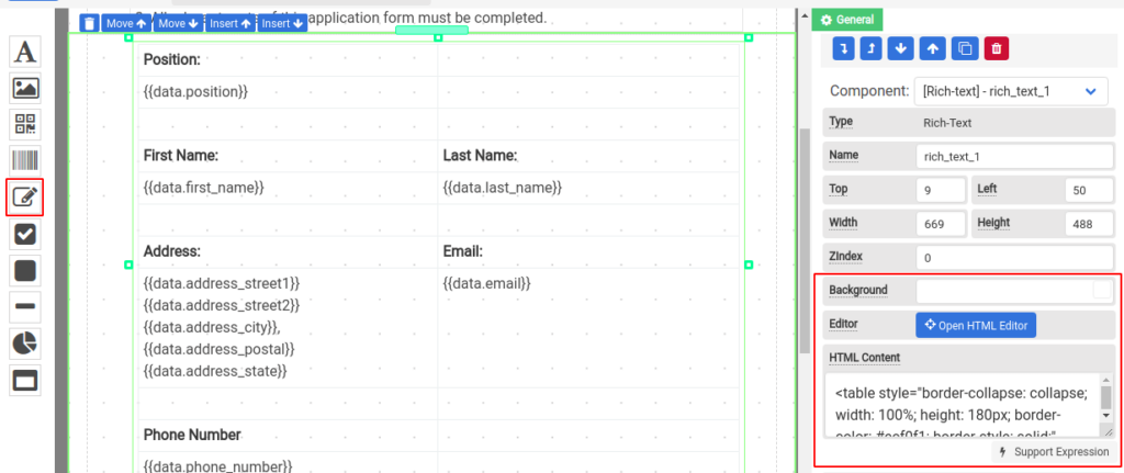
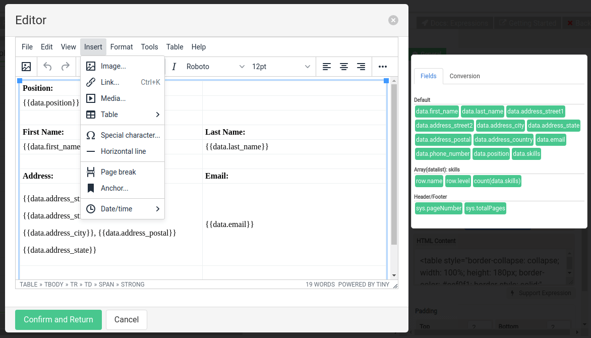
The HTML component lets you compose HTML content. It has a built-in rich text editor that allows you to create tables and HTML elements.
To create an HTML component, drag an HTML component and drop it to where you want it to appear.
2.5.1 Editor for HTML content
To open the editor, click on Open HTML Editor. In the top menu of the dialog, you can insert images, tables horizontal lines, and some other HTML elements. The HTML component supports expressions, you can click on the Fields to insert expressions. Combined with an HTML table, you can use it to design a dynamic form.
Click on Confirm and Return once you have done editing.
2.6 Checkbox
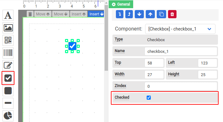
Checkbox component is rendered by default as boxes that are checked (ticked) when activated. To create a Checkbox component, drag a Checkbox component and drop it to where you want it to appear.
2.7 Rectangle
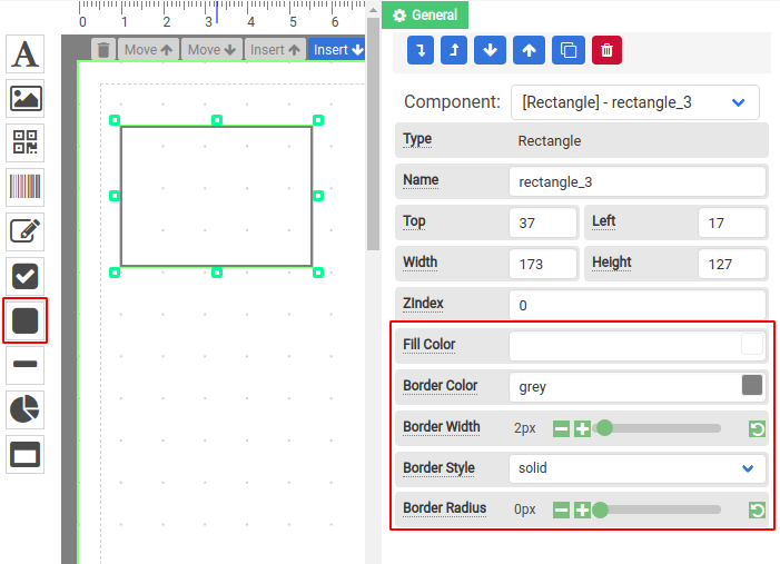
The rectangle component lets you draw rectangle shapes. It supports rounded corners and you can select a fill color and border color for the rectangle shape.
2.8 Line
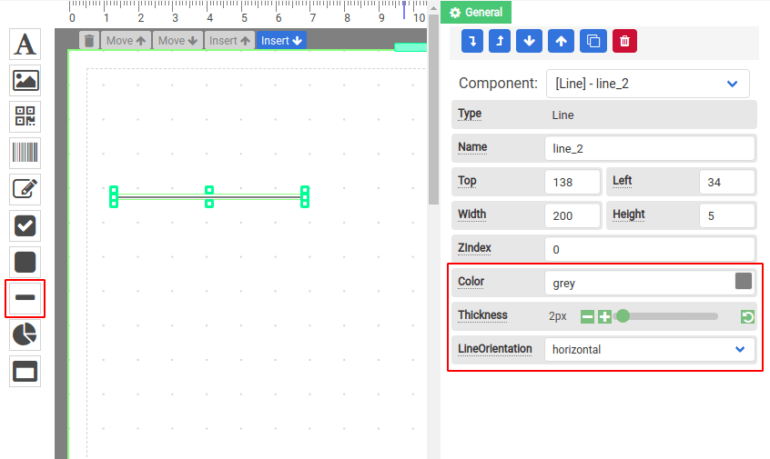
The line component is used to draw vertical or horizontal lines. To create a horizontal line, drag an HTML component and drop it to where you want it to appear.To make a vertical line, select vertical for the Line Orientation. You may also change the Thickness or Color of the Line component.
2.9 Chart
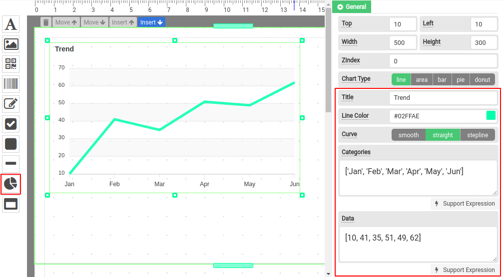
Chart component supports line, area, bar, pie, and donut chart types. To create a Chart component, drag a Chart component and drop it to where you want it to appear.
Extract data from JSON as an array
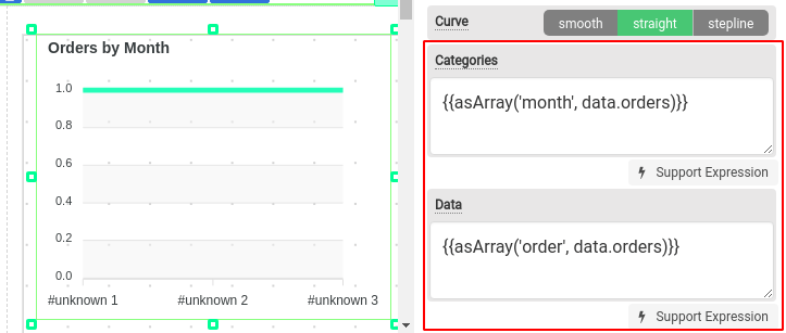
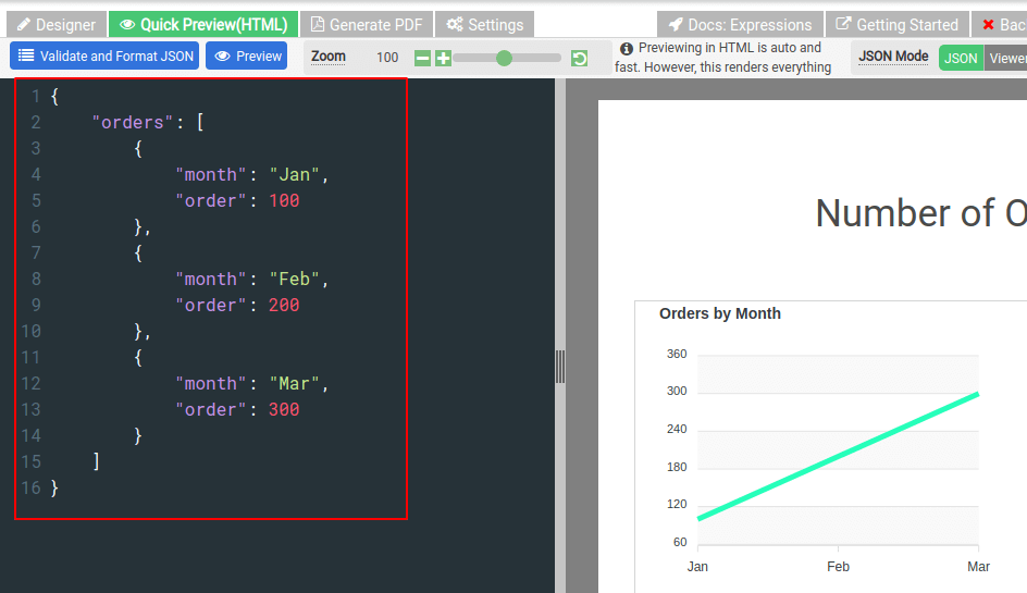
The property Categories and Data only support a one-dimension array. In order to extract the data from your JSON, you have to use the expression function asArray. The following is an example to extract month and order from an orders array using the asArray expression.
2.10 Section & Subsection
A template is divided into multiple sections, and a section is where you can drag-and-drop components, such as Label, Image, Chart component, etc. There are three types of sections: Header, Normal, and Footer.
Learn more about:
i. Section Header, Normal & Footer: Getting started – Header, Footer & Normal
ii. Data-binding: Getting started – Data-binding
iii. Filtering & sorting for section: Getting started – Data manipulation
iv Subsection component: Getting started – Complex data with subsections
2.11 Simple Table
The Simple Table component is designed to display an array in a tabular form. It is a convenient way to display repeating rows without using a repeating Normal Section.
The followings are the steps to use a Simple Table component:
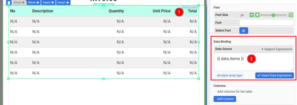
Step 1 – Data Binding
Configure Data Binding to bind the Simple Table to an array
Step 2 – Adding columns
Then, add new columns to the Simple Table component. Click the button Add Columns in the Columns section in the property panel.
A column consists of 3 elements: Column Header, Column Content/Cell and Column Footer.
i. Colum Header
The header of the column, it’s turned on by default. The following is where you configure the header
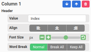
You may also update the Header Settings in the property panel
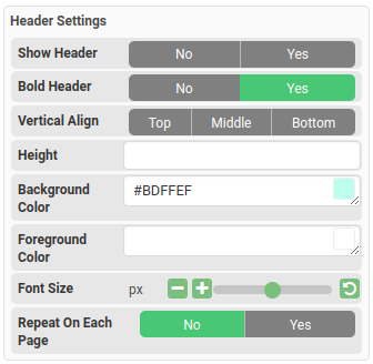
ii. Column Content or Cell
The content of the repeating rows. The cell value can be either an expression of a JSON field.
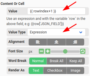
- Value type is set to Expression.
- You can use an expression in the Value
- To access the repeating, use the variable row
- For example, if the Data Source is set to {{data.items}} and in the items array there is a field named description then you may enter an expression {{row[“description’}} in the Value
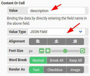
- Value type is set to JSON Field
- You can enter the JSON field in the Value.
- For example, if the Data Source is set to {{data.items}} and in the items array there is a field named description then you may enter the text description in the Value
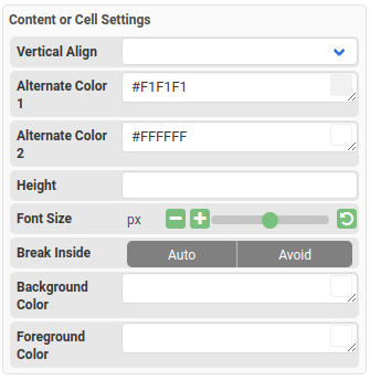
You may also change the Content or Cell Settings such as alternate colors, font size etc in the property panel
iii. Column Footer
The footer of the column. It’s disabled by default and it’s similar to Header.
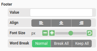
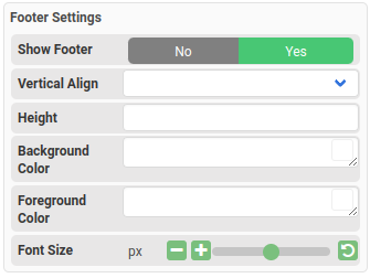
You may also change the Footer Settings such as alternate colors, font size etc in the property panel
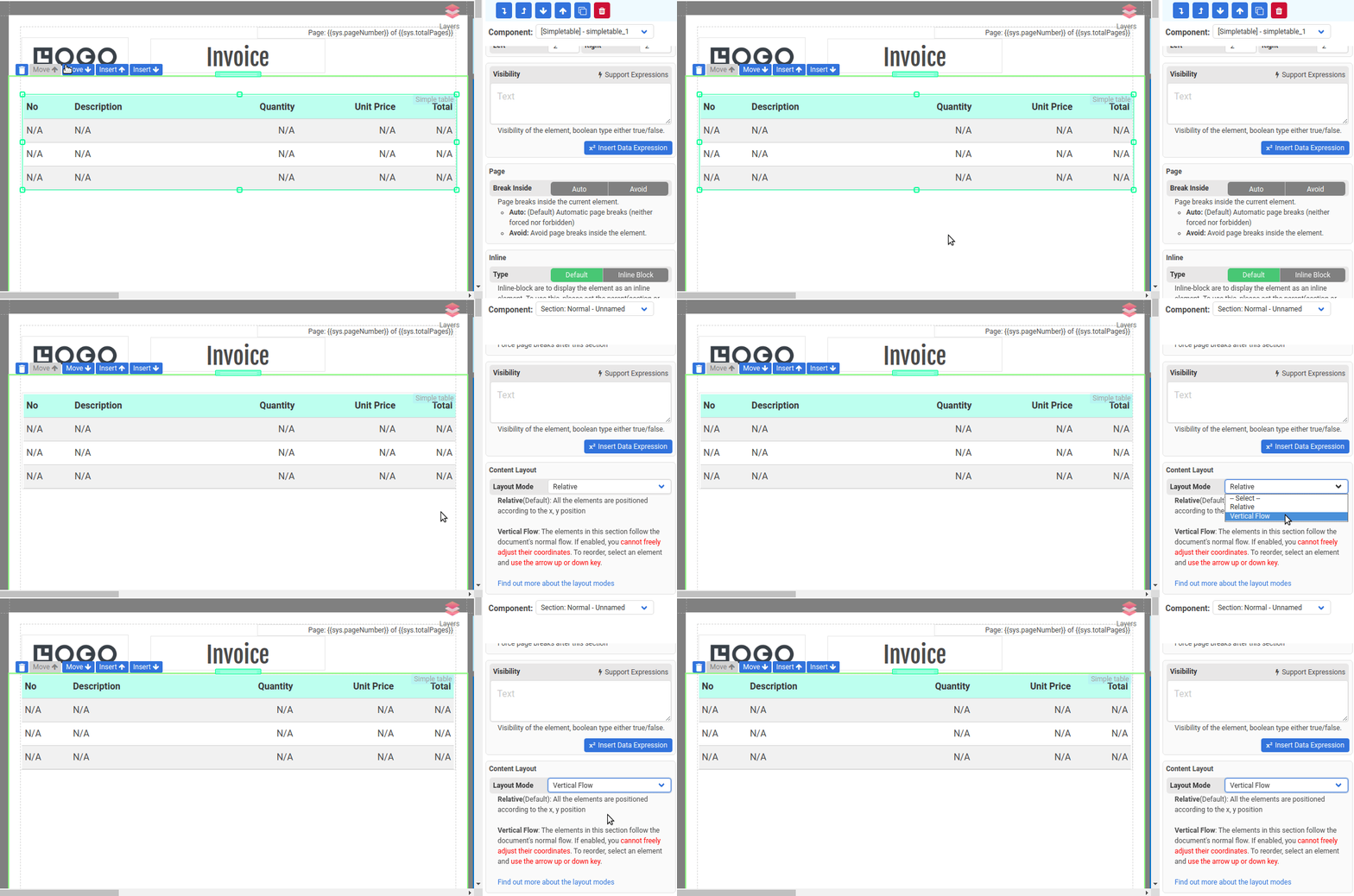
Simple Table spans across multiple pages
If a simple table spans across multiple pages, please set the Layout Mode to Vertical flow for the parent section.
